|
The is my 180 rule assighment. I used Premiere pro.
When I was working with video clips I had to do things like: pay more attention to the transitions and cutting; to make sure that the video transitions were smooth and moved smoothly to the next frame, cause we want to avoid wonky and chunky transitions. Cutting was different too, when cutting a video I needed to avoid overlapping, and where a character would be coming from or leaving from, the position of characters and scene. Plus also the audio, you have to make sure the audio fits in the clip. While a basic images didn't need all this. I didn't really find anything quite difficult, the only thing I can think of was maybe a issue was, the clips, I wanted a different reaction with the characters but I didn't have the clips for that, like when the black T-shirt guy was telling the joking I wanted a more of ecstatic reaction; and the guy in the white T-shirt, I wanted a more exaggerated response. My thoughts on Premiere pro, were that its a good source for making videos and editing them. It had lots of editing options and effect options for all like, clips, audio, texts, etc. Overall I enjoyed using this software and doing this assighment.
0 Comments
What I did differently when creating my video, was this time we used video clips instead of basic images. When using basic images it's was easier to, make transition and cut images; without having to worry as much if it looks wonky; but when using video cuts, it a little more time consuming. When it come to transitions and cutting you have to worry about, if the cut or transitions are smooth, fitting and clear to the viewer; like where the characters are going, and also the scene. Plus audio, you also have to make sure the audio fits the clips.
What I found difficult was making the video only 20 seconds long. I made the mistake of forgetting that important piece of info, this is also another the reason why the title is named "Just forgetful," I had first chose the clips that I wanted to use and then putting them into order of how I wanted them to play. And when I realized that, i had to start cutting and deleting, I was disappointed to have to cut them, I struggled a bit with the lengths of each clip, some shorter than I wanted, but I eventually got it. My thoughts about using premiere pro was, that it's a really good source for making and editing videos. Premiere pro had a lot of options for editing and effects, they had effects for video clips and audio clips, I also was even able to use the effects on my texts; those were the only ones I used.
This is my "Intro to Video" assignment, I use my premiere pro app. This assignment was simple and pretty straight forward. How I did it is first I: made a new project, imported my images, then fitted them all in 15secs and add my text. I learned how to import my images, how to change the length/time of my images, added effects and how to control those effects. I quite enjoyed this assignment it was pretty simple.
This is my reflection, for third quarter, my third quarter was better than my other quarters I enjoyed the assignments we did, they were simple; I really liked using Illustrator it allow you get things done faster like making a logo.
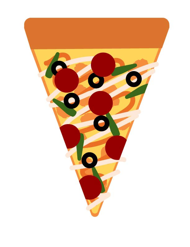
For my personal growth when I first start I had no clue what I was doing; I didn't know what tools did what, I didn't know what shortcut in could take, I was just clueless; but then I got this hang of it, I learned what tools did what and what kinds of short cuts I could take like instead of looking for the tool Ill was click on a key, learned this helped me navigate the software. The artistic skills I gained from this quarter was :better looking art, cleaner, and less of the mess, I also learned about color theory this helped me to learn what colors looked good together and how to make colors of my choice. Things I learned this quarter was how to/use Photoshop, Illustrator and a little bit more of 3Ds max, I learned how to use the pen tool used in Illustrator; to make freeform curves and lines, good for making logos. The shape builder tool used in Illustrator; to delete and add edges of selected shapes. Color theory; to see how colors can affect your emotions and perceptions. And The slate material editor in 3Ds max; designing materials and placing them on top, making them look more realistic and actually that material. Beyond this, using the skills I learned I would like to be able to make more affordable logos for people. Especially one for my dad he needs a new one, he doesn't like his. This is my pen tool logos assignment. This assignment was pretty easy and straight forward, and I enjoyed making this piece and got comfortable using this tool. Working this tool is pretty simple, to move your rod around just click and drag where you would want to start it and to curve it just hold it and move around till you have the curve you want, to change the direction of half of your rod just hold your alt key
and drag, to change direction easily.
This is my box and my Rubik's cube I made it using 3D Max I first had to download all the sides for the box, when I was finished downloading them. I go to the render setup and change the renderer to scanline renderer then I go to the Slate Material Editor, and place a Multi/Sub-Object and edit the parameters, since a box only has six sides, leave six there and delete the rest, then I named them so it would be easier to know which sides, then I put the images in for each side, after putting all the images in, I checked and swap them and had to rotate some of them.
 This is Barto the Menace he destroyed this town, I made this by simply get an image of a destroy town and placing it as my background and then getting an image of my dog and cutting him out and placing him in the background then just adding filters to make it look more like he's actually there and adding painted in shadows, and that's it, it was pretty easy.
I played these three color games, the first game was True color I learned the primary colors, primary colors cant be made, the primary colors are yellow, blue and red. Secondary color are made from primary colors, which are orange, green, blue and purple, and tertiary colors are made from primary and secondary color that are neighbors from each other, which are vermilion, amber, chartreuse, teal and violet, I also learned complementary colors, colors that are said to look good with each other are across from each other on the palette, and mixing two complementary colors will make a neutral gray-brown color. Second "game" was a Hue test, I had to sort were I thought the color would fade to the other color. And the last "game" was Color a color matching game where I had to match the color as fat as I could and as precise as I could, there were levels like Hue, Saturation, Complementary, Analogous, Triadic and Tetradic. Overall I really like this subject.
|